Hosted Page Visual Composer
Contents
Build hosted pages with a drag-and-drop hosted page composer.
How It Works - An Overview
Within the interface, hosted pages created with the Hosted Page Visual Composer are called Visual Pages. Hosted Page Visual Composer provides drag-and-drop formatted rows and content elements for you to build your page from scratch. To build a new page: create a new Visual Page, configure the global settings, and then add rows and content blocks.Create a New Hosted Page
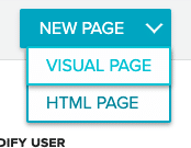
- Select Hosted Pages from the Content menu.
- Hover over the New Page bar to open the page menu. Select Visual Page from the list to open the Hosted Page Composer.
- In the New Visual Page modal, enter a Name and select the Type of page you wish to build (Sign Up, User Management, or Other).
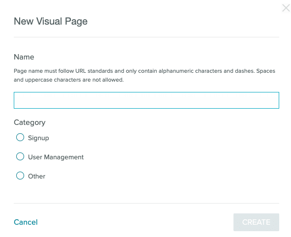
- Use dashes to replace spaces in your page name. The page name forms part of the URL.
Copy Hosted Pages
Copy Hosted Pages within the same account or to a different account.Copy Within the Same Account
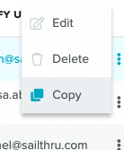
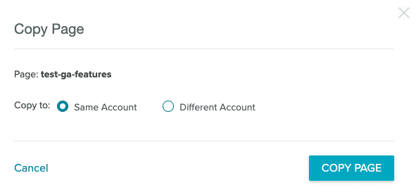
From the Hosted Page List page:- Locate the page you wish to copy.
- Select the three dots at the end of the list entry.
- Select Copy from the menu to open the copy modal.
- Select Same Account and then select Copy Page.
Copy to a Different Account
From the Hosted Page List page:- Locate the page you wish to copy.
- Select the three dots at the end of the list entry.
- Select Copy from the menu to open the copy modal.
- Select Different Account when the Copy modal opens.
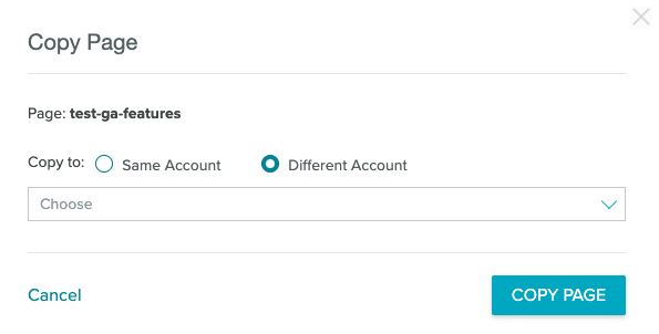
- Select the target account or accounts from the Accounts dropdown menu. You can select one account, multiple accounts, or all accounts.
- Select Copy Page to copy your page.
Hosted Page Settings
Depending on the type of page you're creating, your Setting options will change. Select the gear icon from the top bar to open the Settings.
- Sign Up
Select the List, Welcome Email, and Page Redirect.
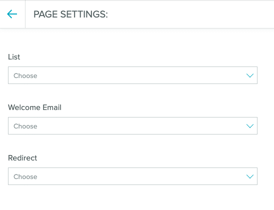
- User Management and Other Select the Page Redirect.
Structures and Blocks
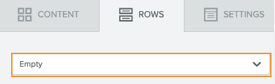
Create a hosted page from pre-built rows and content elements.Rows
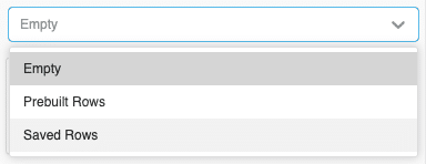
Form the structure of your hosted page with pre-built rows. Rows serve as containers for the content in your page, including text and images. Select an empty row to build your page from scratch, or select a pre-built row that already has some elements available for customization. New pages start with a single column structure in place.Saved Rows
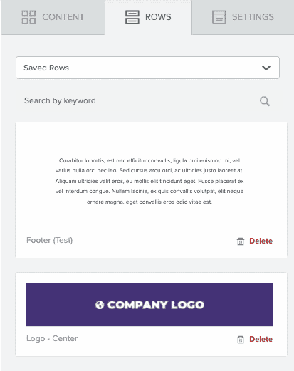
Saved rows help you streamline your page creation process. Create a universal header or footer once and use it across all your email messaging. Either process - saving or using a saved row - requires only a few steps to complete. Notes:- It is not currently possible to rename Saved Rows.
- Your Saved Rows appear in the order you created them, starting with the most recent.
- If you can't find your row, use quotation marks around the name when searching. This returns an exact value.
- There is a maximum of 30 saved rows that can be displayed.
Create a Saved Row
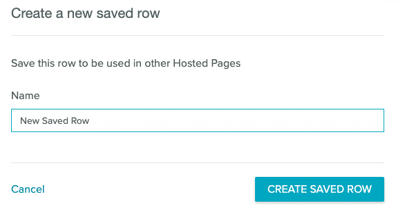
- Select the row you would like to save.
- Select the save icon
 from either the row itself or the row properties menu.
 - Give your row a name and select Create Saved Row. Your saved row will be available.
Use a Saved Row
When you're using a Saved Row, you can edit the row within a page. The edits you make will only affect the page, not the Saved Row itself.- Select the dropdown menu under Rows.
- Select Saved Rows from the menu.
- Search for or scroll to the saved row you would like to use. Drag the saved row to your template as you would with any other row.
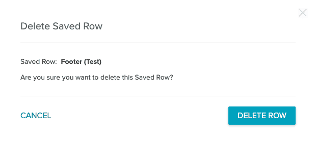
Delete a Saved Row
- After searching for the row you'd like to delete, click on the delete icon on the lower right-hand corner of the row.
- Click the "Delete" button.
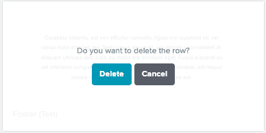
- To confirm you'd like to delete the row, select the "Delete row" button in the modal.
Content Elements
Content elements are blocks that you can drag and drop into your page.Title
Add a title element to your hosted page.Text
To add text to a page, select the content tab and drag the Text content block into a structure. You will see the following text appear: "I'm a new Text block ready for your content." Click anywhere on that sentence to edit the text (you can triple-click the text to highlight and replace it). A number of text formatting tools is displayed:- font family
- font size
- bold, italics, underline, and strikethrough
- text alignment
- numbered and non-numbered bullets
- text and background color
- link text
Image
The Image block comes with an image uploader to receive your images. You can either drag an image file on top of this block or click "Browse" to reuse images from your account or other services. You will have several methods for uploading images, including a file upload, upload from a URL, import from services like Instagram, as well as a free image search. By default, images will automatically be sized to fit the structure within which they are contained. This is the recommended setting to ensure images resize correctly for any screen. However, you can disable automatic sizing and set the image to be a percentage of the structure's column. Use the Properties panel to set the alternative text as well as any destination URL. If you intend on populating the image with a dynamic image like a countdown timer or an advertisement, you can select "dynamic image". This will allow you to set a dynamic image for the send while still viewing a sample image in the composer. Notes:- When uploading an image with the same name as an existing image, the image will take approximately 1 hour to propagate to any templates using the image. Make sure to wait for the image to propagate before sending. This restriction only applies to replacing images. New images will immediately propagate.
- The maximum allowed file size is 20MB.
- Animated GIFs wider than 1920px will be resized on upload and become static images. We recommend using GIFs under 1920px in width.
- All image file types are allowed.
- Total image storage is not currently capped for the lifetime of your Saithru account.
Button
Insert a call-to-action button that can open a web page in the user's browser. Selecting the text of the button in the canvas will provide a limited text editor. The action and destination URL are set in the Properties panel, where you can also set the button's background color and text color, border, width, and roundness.Note: The button action "send email" does not support Zephyr expressions in the subject or body of an email. Use the HTML content block if you wish to use Zephyr.
Divider
A customizable horizontal rule.Social
A configurable set of social network buttons. Choose a design in the Properties area, then configure which networks to include and your ID/address for each.HTML
Using your own code may affect how the page is rendered. Make sure to use correct and responsive HTML. Where possible, it is recommended to build with the editor's options instead, to ensure code is valid and the design is responsive. To add an HTML block to your hosted page:- Decide on your formatting. If you're using the available row structures, drag them into place on your template.
- Drag an HTML block from the Content Pane to your desired location.
- Click the HTML block. The Content Properties pane opens for your HTML block.
- Add your HTML content.
- Finish editing your page.
Video
Add a YouTube or Vimeo URL to automatically generate a preview image. The image will link to the provided URL in a new tab.Form
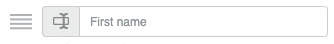
Use the built-in Form element to automatically add a custom form to your page. Dropping the form element onto your page adds a form that collects First name, Last name, and an Email address by default. Select the form to open the Content Properties tab for the form element. As with most content elements, you can customize the width, alignment, font family, font weight, and font size.Form Elements
Beyond the default fields, you can add and customize fields for different types of input:- Single Choice To enter your options, select the blue Edit option under the field to open the Edit Field modal.
- Checkbox (multiselect) To enter your options, select the blue Edit option under the field to open the Edit Field modal.
- Dropdown To enter your options, select the blue Edit option under the field to open the Edit Field modal.
- Date Include a date picker in your form.
- Custom Variable #1 through #10
To select the type of field and enter your options, select the blue Edit option under the field to open the Edit Field modal.
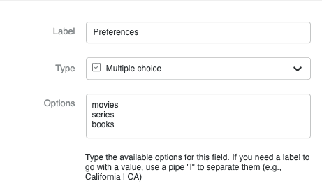
For multiple choice variables, the values will be saved as an array on the profile.

- Label #1 through #10 To select the type of field and enter your options, select the blue Edit option under the field to open the Edit Field modal.
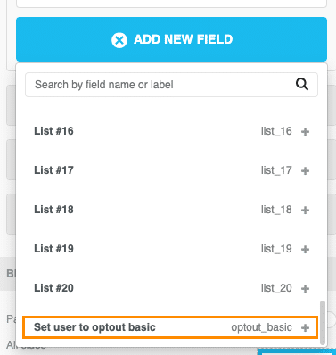
- List #1 through #20 To select the type of field and enter your options, select the blue Edit option under the field to open the Edit Field modal.
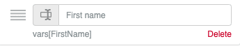
- Enter a new placeholder name for the field or place your cursor at the end of the existing name.
- Add a pipe.
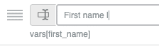
- Enter your new variable name. For example, instead of first_name, you might use FirstName.
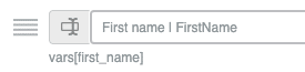
- Save the page. When the page is saved, select the form and locate Manage Fields in the content properties panel. Your new variable should show under the field:
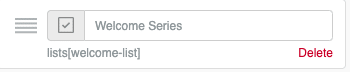
- Add one of the List options to your form fields.
- Select the placeholder text and replace it with the user-friendly name of a campaign, for example, Weekly Newsletter.
- Add a pipe and the list name. If your list is called welcome-list, then that should go after the pipe. E.g.: Weekly Newsletter | welcome-list
- Save the page. When the page is saved, the list name you entered shows below the editable field:
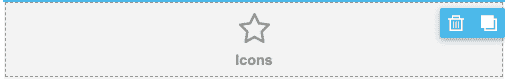
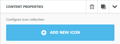
Icons
Create flexible, branded designs with custom icons. To add a custom icon:- Select the Icon content block from the Content tab and drag it into position. You'll see the placeholder content.
- Select the content section to open Content Properties in the Content tab.
- Select Add New Icon.
- You'll see a default image (the star in the gray circle). Select Change Image to customize the icon.
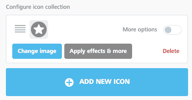
- Toggle More Options to open extended options.
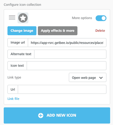
- Image URL Add a custom image URL for any image you're not uploading.
- Alternate text Add alternate text that describes your icon.
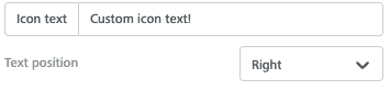
- Icon text
The text that appears next to your icon. If you're using a custom icon set as bullet points, add your text in the textbox. Control where your text appears with the Text position dropdown.
- To add more than one icon to the same block, select Add New Icon.
- Save your design.
Menu
Add a menu element to your page.- Create a new hosted page or open an existing one.
- Drag a menu block into the page.
- Select the menu block in your template to open the Content Properties tab.
- Add and configure menu items; set the appearance properties for the menu; set options for the whole block; and choose whether or not this is a mobile menu from the Content Properties tab.
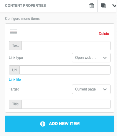
- Save your work. Preview and test your page to make sure your menu works as expected in a variety of environments.
SMS Capture
Capture SMS numbers and user consent with built-in SMS form fields.SMS Consent
To align with TCPA (Telecommunications Protection Act) regulations, customers must obtain consent for transactional and marketing messages separately. Capturing consent cannot be tied to a single checkbox. The text must also contain explicit language around the use case the consent is tied to (e.g. "I would like to receive marketing messages." or "I would like to receive updates.")SMS Form Fields
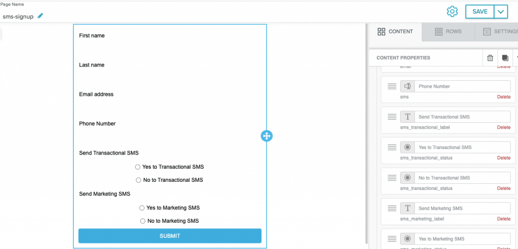
- SMS field for the phone number
- Radio button for opt-in for
sms_marketing_status - Radio button for opt-out for
sms_marketing_status - Radio button for opt-in for
sms_transactional_status - Radio button for opt-out for
sms_transactional_status
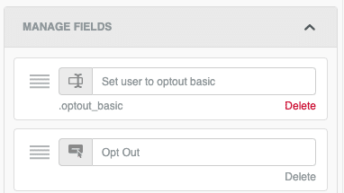
User Opt-Out
Give users an opt-out button with built-in form options. The built-in opt-out sets users to.optout_basic. This will be shown in the user profile as Optout (Marketing). It will opt users out of all marketing messaging, allowing them to receive transactional messages like password resets.
The opt-out option must be added in a new form element.
To add an opt-out option to your form:
- Add a new form element to your page.
- Remove all default form fields. You'll only have a Submit button.
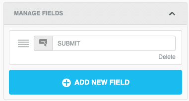
- Add the Set user to opt-out basic field.
- Change the default text of the button to something like "Opt Out" or "Unsubscribe".