Analytics 06/17/20
Email Summary with Table View
The Table View is our vision for helping you explore your Campaign sends!
Sailthru’s Analytics in MY are getting yet another upgrade! We know many folks appreciate being able to sort through all the different emails that were sent out to end users. Being able to compare and browse amongst them is crucial to figuring out what worked and what did not, and how to iterate upon the content of their sends.
That’s why we’re proud to announce this new Table View! We took some elements from some of our original features (the Campaign Summary page linking from a row to the Campaign Detail reporting) and also made large improvements to the user experience.
We crop the rows of data so that the table performance is snappy and you can focus on sifting through high performers or low ones. You can sort on any column quickly across the broader data set. The link to the table view is also sharing-friendly, so that you can collaborate with a colleague, and they’ll see what you see. We’ve also iterated on the filter panel interface so that it is more distinct, intuitive, and scale to accommodate more filters in the future.
 How it works
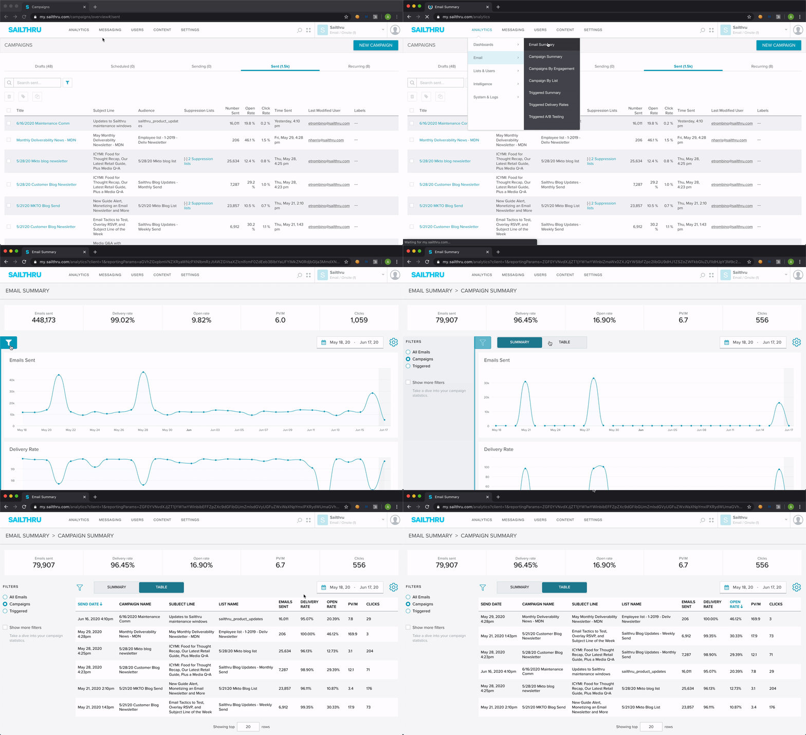
Users can access this new view within the ‘Campaigns’ section of the Email Summary feature. While in the Email Summary feature, click on the new filter control that’s pinned to the left margin next to the charts. When that area is open, select the ‘Campaigns’ option. Then, click the Table button to toggle the view, from summary charting to the sends that roll up to the charted metrics.
If you need to see more sends at a given time, there is a crop control at the bottom of the table that’s initially set to the top 20 sends that are a part of the time range and filters that you’ve selected. You can expand that up to more rows (90 to start) by hovering and clicking the plus symbol.
Advanced usage
For instances where you want to navigate and iteratively find lists to include in the filtering without having too many tabs open, the ‘Show more filters’ checkbox helps you quickly apply or hide the List filters you’ve selected. Try this method out:
- Select a list that you’ve sent to recently, and apply it to the Email Summary charting.
- Toggle between the charting and the table to see the focus on that list’s sends.
- Then, click on the checkbox next to “Show more filters” to mark that checkbox empty and hide the selected list filter.
- Try flipping it back on to mark the checkbox on.
General remarks
The feature is available for everyone as of today. To learn more ways to leverage this new Email Summary feature, Getstarted documentation will be updated shortly.
 How it works
Users can access this new view within the ‘Campaigns’ section of the Email Summary feature. While in the Email Summary feature, click on the new filter control that’s pinned to the left margin next to the charts. When that area is open, select the ‘Campaigns’ option. Then, click the Table button to toggle the view, from summary charting to the sends that roll up to the charted metrics.
If you need to see more sends at a given time, there is a crop control at the bottom of the table that’s initially set to the top 20 sends that are a part of the time range and filters that you’ve selected. You can expand that up to more rows (90 to start) by hovering and clicking the plus symbol.
Advanced usage
For instances where you want to navigate and iteratively find lists to include in the filtering without having too many tabs open, the ‘Show more filters’ checkbox helps you quickly apply or hide the List filters you’ve selected. Try this method out: