Design Modes
Contents
Create specific messaging for email or mobile with Email Composer design modes.
How It Works
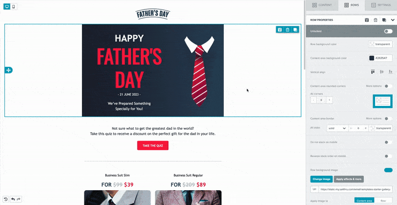
Design mode is controlled by a toggle. Select the computer screen or the mobile phone image in the top left corner of the canvas to switch between modes. You can design just for mobile, just for desktop, or for both. The selected mode shows blue.
 Hide elements for either design mode if you're creating one template for both environments. Each row and content block has the Hide on property in the property settings panel.
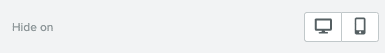
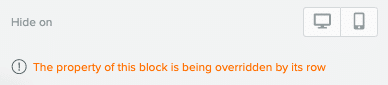
If you hide a row, that overrides content block settings.
Toggle visibility for hidden rows using the icon next to the mode toggle.
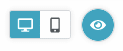
When you select the icon, anything hidden for your current design mode will not be visible. If you want all content visible, select the icon again. When all content is visible, the icon is blue and hidden content is blurred.
Mobile Mode
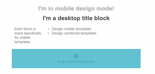
The mobile design canvas is sized for mobile messaging, so you know how your message appears in a mobile environment as you're designing it.
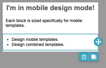
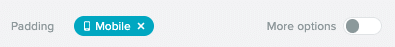
Multi-column rows are stacked in mobile mode. The preceding screenshot shows a title block, a paragraph block, and a list block. The row used in the template is a multi-column one. Some elements include properties that you can set specifically for mobile elements. These are marked with a Mobile tag. When you set one of these properties in mobile mode, the tag is blue.